/

Detail project

Overview

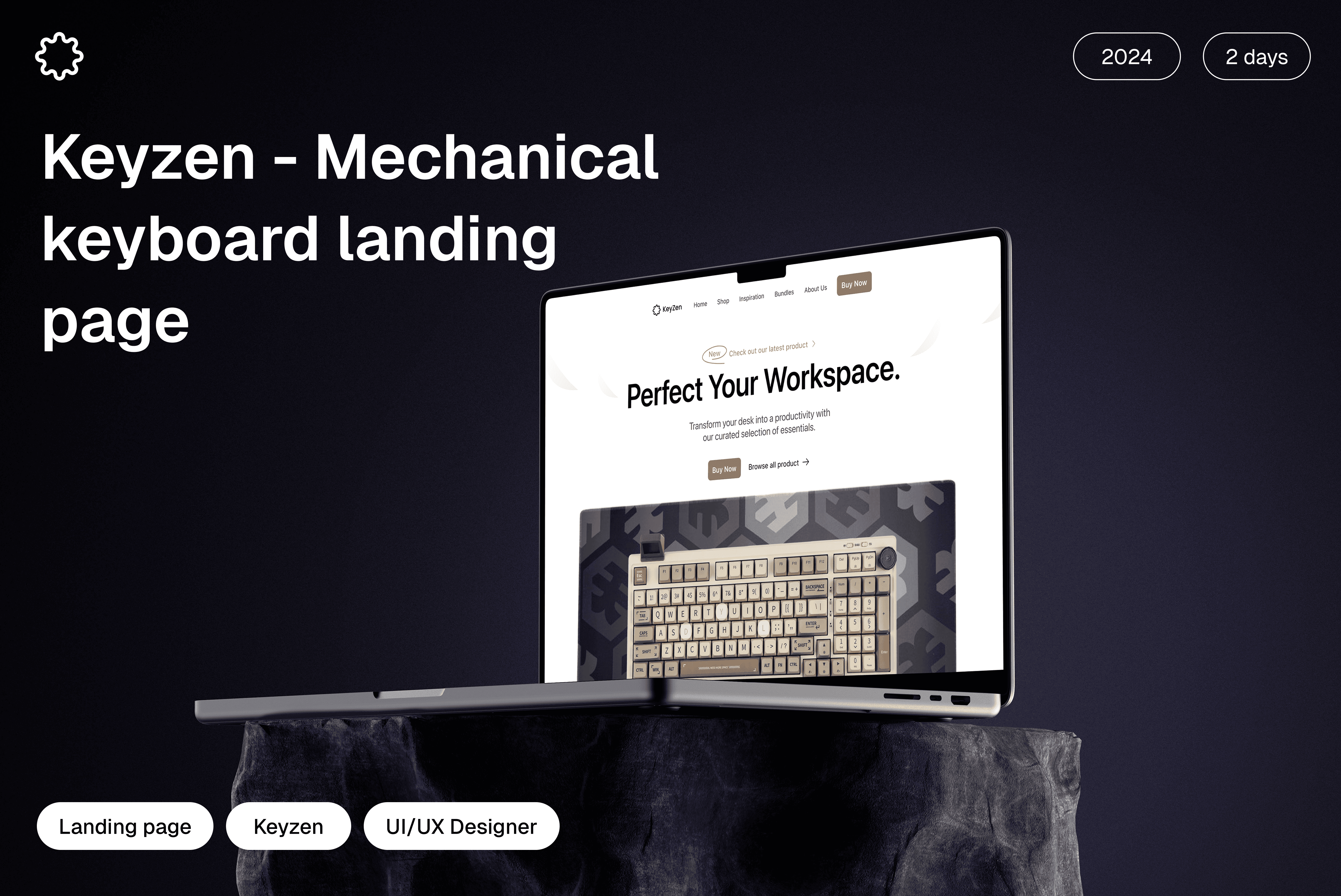
Showcasing a Premium Mechanical Keyboard Experience

This landing page showcases a modern and responsive design for a mechanical keyboard brand. Built to highlight product features, aesthetics, and user experience, it demonstrates my skills in layout design, visual hierarchy, and user-centered UI/UX.

The Problem

Bridging the Gap Between Product and User Experience

Many mechanical keyboard brands lack a strong digital presence that clearly communicates their product’s value and experience. Poor layout, cluttered design, and unclear messaging make it hard for users to explore features or make confident purchase decisions.

1.

1.

Poor Visual Hierarchy

Poor Visual Hierarchy

Users struggle to find key product features or CTAs due to cluttered layouts and inconsistent design elements.

2.

2.

Unclear Value Proposition

Unclear Value Proposition

Many landing pages fail to communicate what makes the keyboard unique or why users should care.

3.

3.

Lack of Product Showcase

Lack of Product Showcase

Keyboards often aren't displayed in a visually appealing or interactive way, making it hard to appreciate design and build quality.

4.

Low Mobile Optimization

Some pages perform poorly on mobile devices, causing frustration and higher bounce rates.

The solution

A Clean, Focused Experience That Highlights the Product

I designed a clean, responsive landing page that solves key usability and branding issues. The layout highlights the keyboard’s unique features through strong visual hierarchy, high-quality imagery, and clear messaging. With mobile-first optimization and consistent branding, the page delivers a smooth and engaging experience across all devices.

Our Goal

Our Goal: Craft a Seamless, Product-First Experience

Clear Visual Hierarchy

Clear Visual Hierarchy

Product-Centered Design

Product-Centered Design

Strong Value Proposition

Strong Value Proposition

Mobile-First Approach

Mobile-First Approach

Consistent Branding

Consistent Branding

Visual

The visual design focuses on a clean, modern aesthetic that emphasizes the product’s premium feel. I used bold typography, balanced white space, and high-contrast color schemes to create clarity and visual hierarchy.

Hero section

The hero section is designed to make a strong first impression with a bold headline, high-quality product image, and a clear call-to-action. It instantly communicates the brand’s value and product appeal, setting the tone for a premium, user-focused experience.
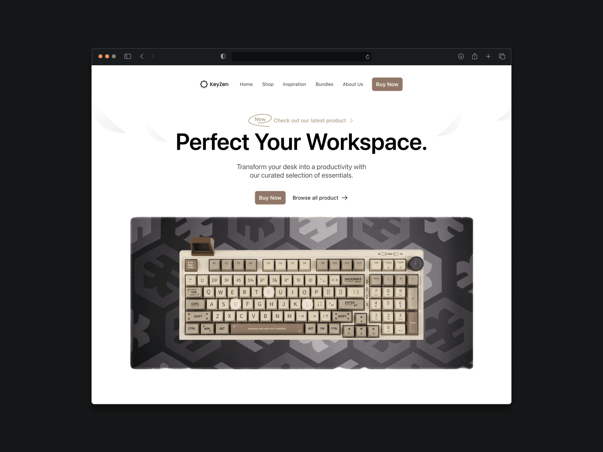
Product overview

This section highlights the key features of the mechanical keyboard — from switch types and build quality to customizable RGB lighting and ergonomic design. It’s designed to quickly inform users of what makes the product stand out, combining visuals with concise descriptions for easy scanning.
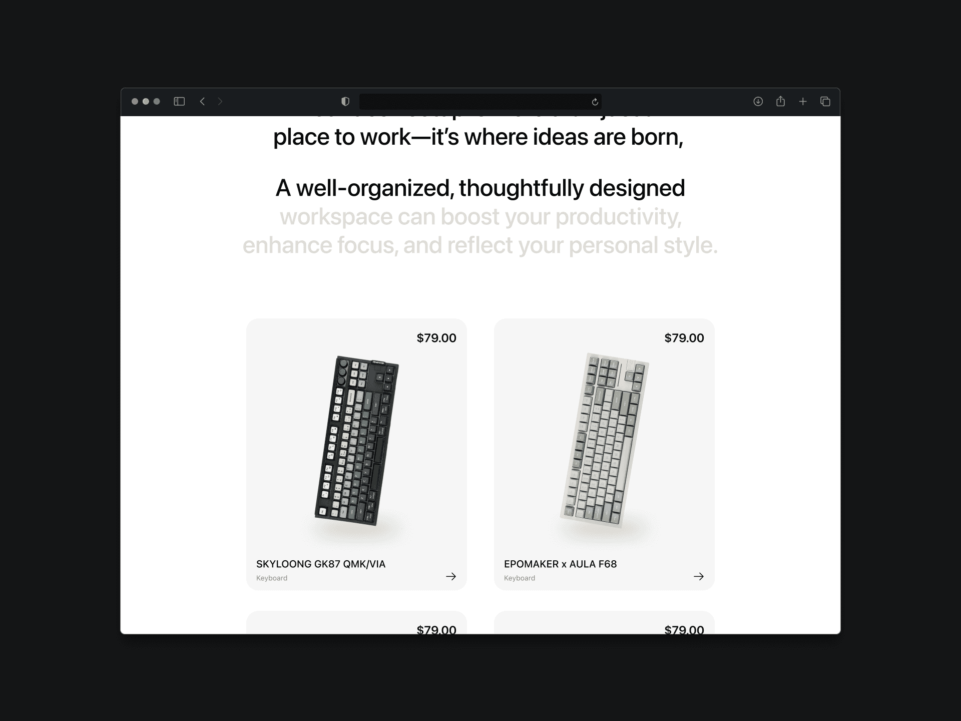
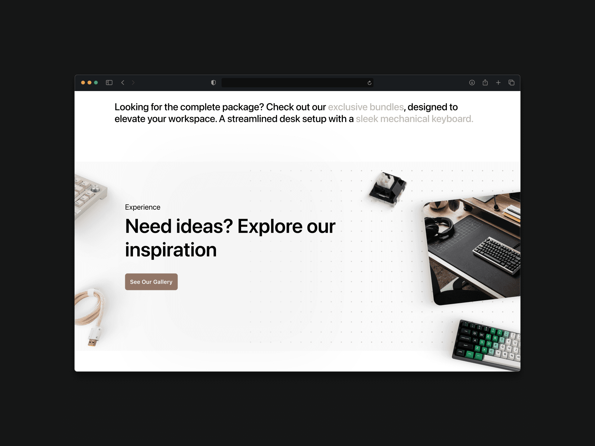
Desc setup

The setup section showcases how the mechanical keyboard fits into real-world environments—whether for gaming, work, or creative use. Through lifestyle imagery and clean layouts, it helps users visualize the keyboard as part of their personal desk setup, emphasizing both aesthetics and functionality.
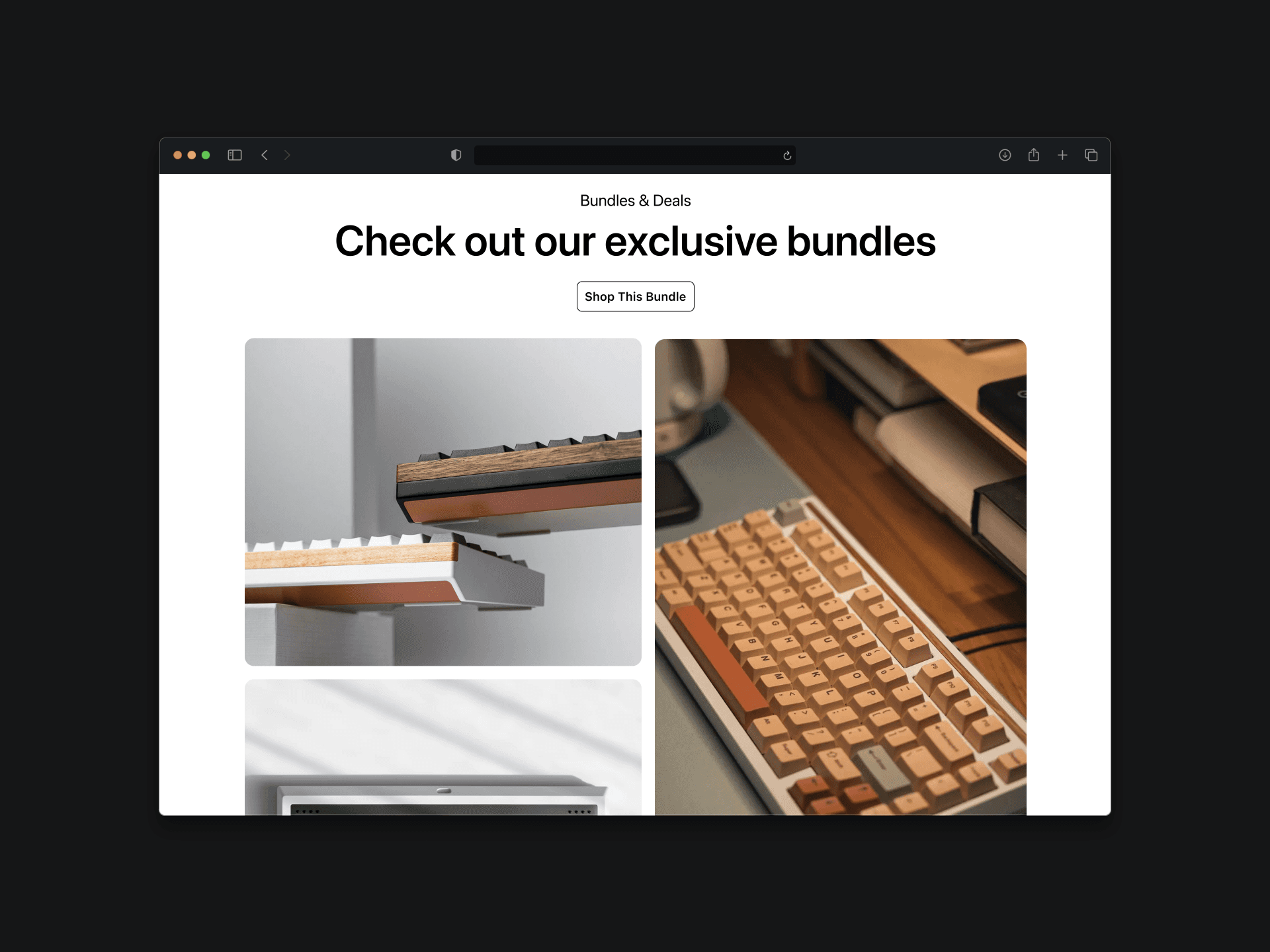
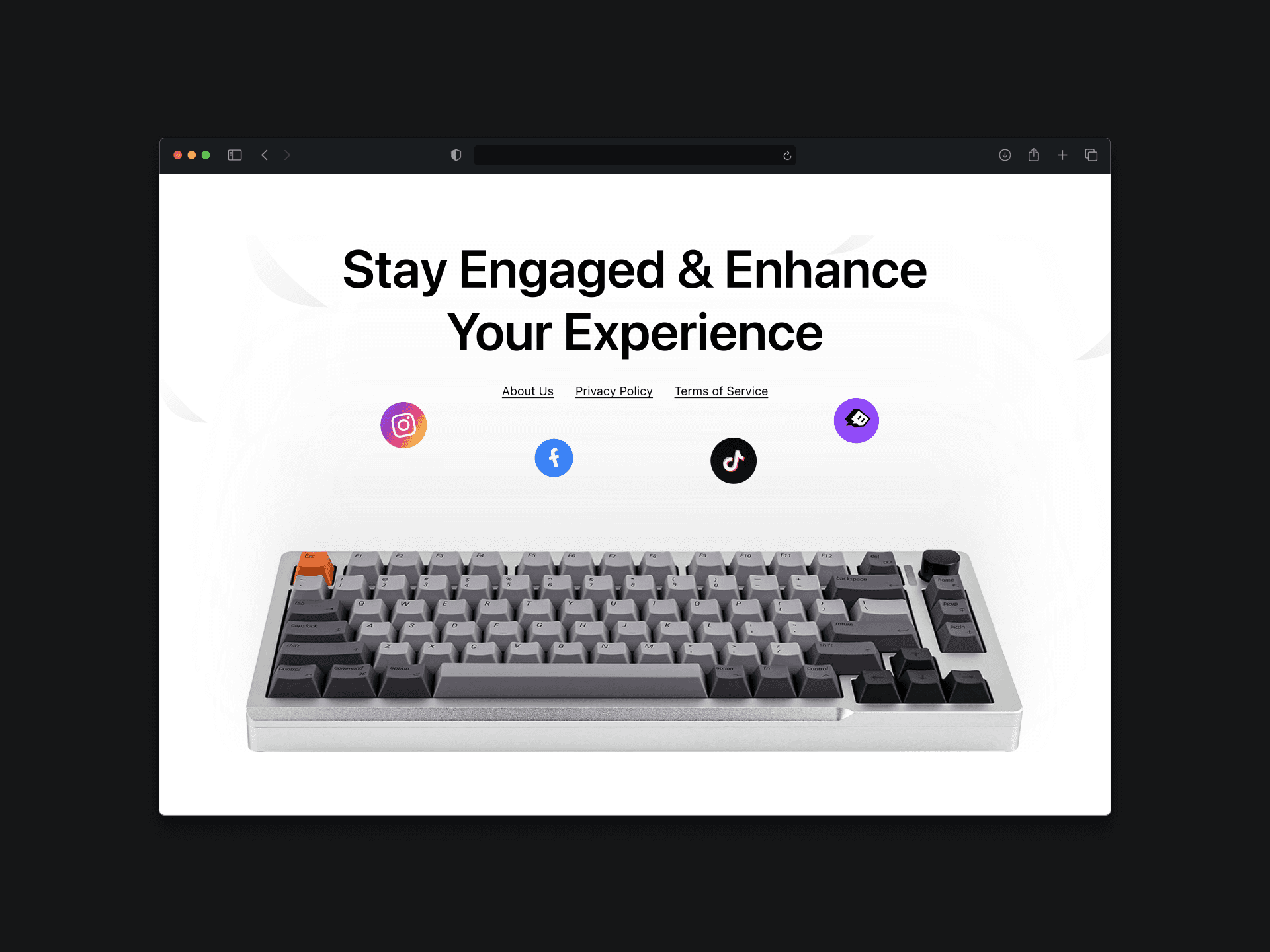
Bundle & Deals

This section highlights exclusive offers, keyboard bundles, and limited-time discounts to add value and encourage conversions. Whether it’s a full set with keycaps, wrist rests, or switch kits, users can easily find the best deals tailored to their needs.

The solution

A Clean, Focused Experience That Highlights the Product

I designed a clean, responsive landing page that solves key usability and branding issues. The layout highlights the keyboard’s unique features through strong visual hierarchy, high-quality imagery, and clear messaging. With mobile-first optimization and consistent branding, the page delivers a smooth and engaging experience across all devices.

Call to Action

The CTA section is designed to drive user engagement with a clear and compelling message. Positioned at the end of the page, it encourages visitors to take the next step—whether it's exploring products, making a purchase, or signing up for updates—through a bold button and concise copy.

Footer

The footer provides quick access to essential links, including navigation, contact information, social media, and support. Designed with simplicity and clarity in mind, it ensures users can easily find what they need at the end of their browsing experience.

The solution

A Clean, Focused Experience That Highlights the Product

I designed a clean, responsive landing page that solves key usability and branding issues. The layout highlights the keyboard’s unique features through strong visual hierarchy, high-quality imagery, and clear messaging. With mobile-first optimization and consistent branding, the page delivers a smooth and engaging experience across all devices.

Create a free website with Framer, the website builder loved by startups, designers and agencies.